“There are three kinds of lies. “Lies, damned lies and statistics.”
This quotation is often attributed to former British Prime Minister Benjamin Disraeli, although the coinage is in doubt. Personally, my money is on Mark Twain. Not because of any particular knowledge but because it sure sounds like something he’d come up with.
In general, I’m in agreement with the assessment of the use of numerical analysis to bolster weak arguments. I’m in the business of making presentations and I can make a graph dance with data designed to show only the side I want you to see. I don’t mess with the data, only the way the data is depicted in the picture. It’s not remarkable, but you’d be surprised how many presenters don’t pay attention to the power of their pictures and how many audiences don’t realize they’re being manipulated.
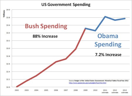
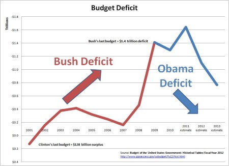
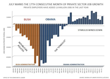
With that said, I present three charts that are making their way around the Internets now that we’re done with the Hurricane Hysteria (for now). The data in the charts is not complicated and therefore not subject to the kind of manipulation discussed above (that’s the way to tell if you’re being toyed with–ask yourself about the underlying complexity of the data. If it should be simple but appears complex, you’re being played). All three charts concern federal spending and the budget deficit. The data is sourced from the Budget of The United States and the Bureau of Labor Statistics. I have not independently sourced or verified the data.
The charts were originally produced here, and the author of that site is responsible for the captioning (of which I’m not necessarily a fan). Further, I think that the accuracy of the estimates for 2012 and 2013 should be highly discounted, given the dismal performance of the U.S. economy. I think it’s fair to say that the only way the numbers depicted become reality is with a rather substantial economic turnaround–one that has not made itself apparent at this point.
Recently, former Bush II speech-writer David Frum (author of the phrase “axis of evil” and other bell-ringers) wrote what I think is the most provocative and eye-opening couple sentences about the state of political discourse and economic thought and information on his blog, FrumForum.
Imagine, if you will, someone who read only the Wall Street Journal editorial page between 2000 and 2011, and someone in the same period who read only the collected columns of Paul Krugman. Which reader would have been better informed about the realities of the current economic crisis? The answer, I think, should give us pause. Can it be that our enemies were right?
So, in the interest of providing information that might run counter to your current thinking on the topic and with all the caveats noted above, here are the graphs.

It's a lot of money, but certainly not as big a change as some would like you to think it is.


Not information you'll get from watching CNBC.


 Posted by Mark Wegener